Designing Twelve Angry Men – Yannik Larivee
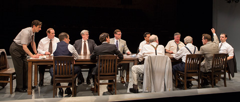
On stage at Soulpepper until July 19 is Reginald Rose’s tension-filled jury room drama Twelve Angry Men. Directed by Alan Dilworth, the play is set in 1957 and centres on the fate of a young man accused of murdering his father; a jury of 12 strangers must decide the young man’s fate. The cast includes a wealth of Canadian talent, including Stuart Hughes, Tim Campbell and Joseph Ziegler. To bring the era to life in a unique alley configuration on the Michael Young stage, set and costume designer Yannik Larivee talks about how character informs design, how he created a pressure-cooker atmosphere, and how Rose’s modern classic remains relevant today.
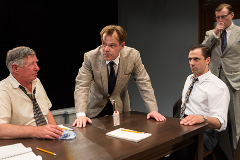
For this show I had references to show the actors – 1957 style, how men dressed in that time – but mostly I talked with each actor about their characters before designing the costumes. As designers we don’t often get to do that – usually designs are decided well in advance of a show, especially in opera or ballet. You can tweak details perhaps but really that’s it. Here, at Soulpepper and with this play, I had a great opportunity to delve deeper into how the characters can inform the designs. The actors at Soulpepper know their characters so well – where they’re from, what they think. Those subtle details can be mirrored in the designs; maybe you have a tie pin on this juror, or maybe you don’t. The play takes place on an oppressively hot summer’s day in New York. I had to think about that setting, about how a character may be hot and take their jacket off. Those details made their way into the costume designs.
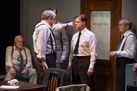
As one example, William Webster plays Juror 10, a man with deep right-wing convictions. He has money, but he’s a bully and very narrow-minded. His outfit was more era-informed than some – a high waist, pale colours, suspenders. It is a design to reflect the character’s views and background, that conservative personality. On the opposite design end is Stuart Hughes, who plays Juror 8 – the Henry Fonda role from the 1957 movie, and he is the opposite of William’s character. A man of more avant-garde thinking, his outfit includes details that break away from the conservative look of the others, such as a knit tie. His look is a little looser, a little more forward thinking.
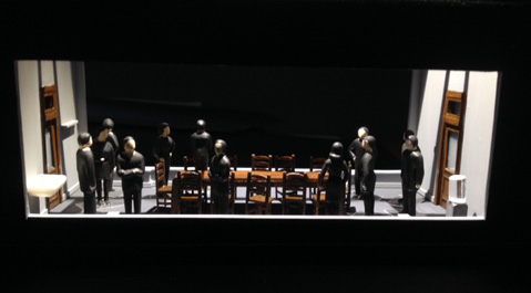
In terms of set design, we’re staging this show, which is typically done on a proscenium stage, in a traverse configuration with the audience on both sides of the stage. It’s done this way, as opposed to in-the-round, to allow for the separation of space between the two rooms in the script. It’s also to increase the tension for the audience, to create that voyeuristic sense of looking down into the jury room where these men are thrown into turmoil.
In my mind it was important to bring two things to the set design: the feeling that the characters are trapped, and to introduce elements of nature into the space. I was interested in playing with the elements of the room, the environment. The design elements tend to mirror the character’s reality. The design enhances the tension.
The set is an extension of the characters, it’s about the psychology, the world they’re in, and this is not just a straightforward jury room. Traverse is much more psychological. We wanted to draw the audience into the space, so the lighting was expanded over the audience to break down the barriers. Set design is not only about space, it’s about time as well. The characters evolve more in time than space, especially in this play. So my approach was about allowing time to move through and transform the space.
There is also in the play a constant shift between chaos and order. Everyone has a seat by jury number at first, there is order. From there it progresses and alternates between chaos and order. At one point in the play there is a thunderstorm, which reflects the escalating pressure in the room, and a sense of unravelling in the proceedings. There is rain built into the design, and of course the lighting, designed by Kimberly Purtell, will shift to match the weather changes over the time in the jury room.
There are only a few companies that allow such a creative process, and this kind of approach to design. When we first spoke about this play, Alan said to me: “I want to make a piece of art with you.” That’s how we created a world in which the characters would evolve. Alan gave me a lot of inspiration – the world, the time, the era, what are these characters going through – Alan’s ideas went beyond the anecdote of the jury. And while the world on stage embodies the era – 1957 with its racial clashes, and cold war and atomic era uncertainty – it will still touch the audience of now. It’s still relevant. There are still widely different opinions on social issues. This play will inspire the audience to examine their own prejudices and our country’s own democratic practices.
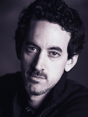
Production photos by Cylla von Tiedemann. Headshot supplied.
