Orlando’s design concept by Lorenzo Savoini
Take an in depth look at the set design for Orlando to deepen your understanding of the set before you see the show.
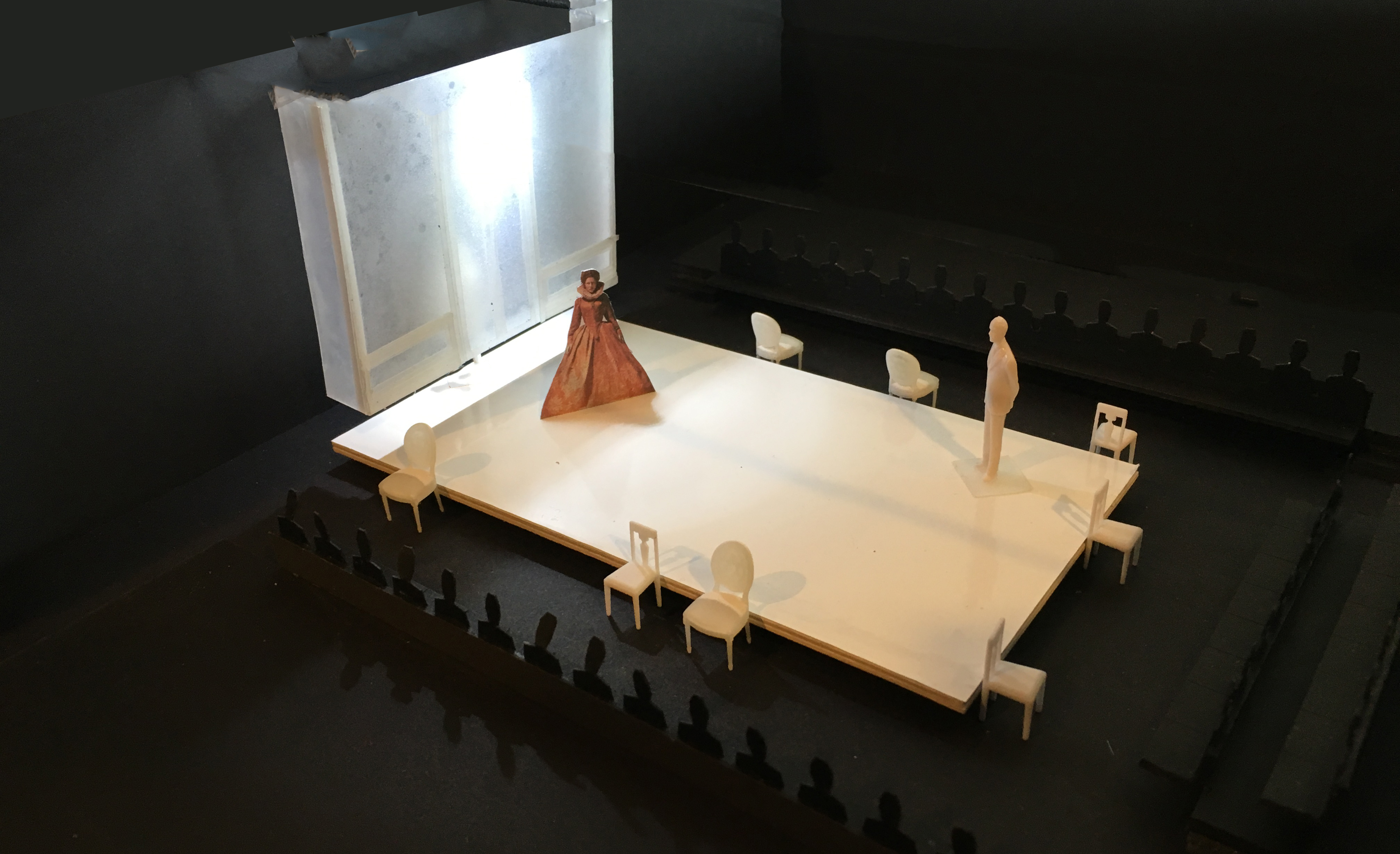
Orlando is an astonishingly beautiful tale by Virginia Woolf adapted for the stage by Sarah Ruhl. In classic Ruhl fashion she gives it a theatrical life by provoking our imaginations and adding endless magic and whimsy. The story follows the life adventures of Orlando over four centuries in a fantastical fairy tale-like way. Katrina Darychuk, our director, knew she wanted to stage the production in a thrust configuration with audience on three sides, which evokes a more Greek/Elizabethan age staging. This makes for a very intimate three-dimensional experience for the audience and allows for great staging dynamics.

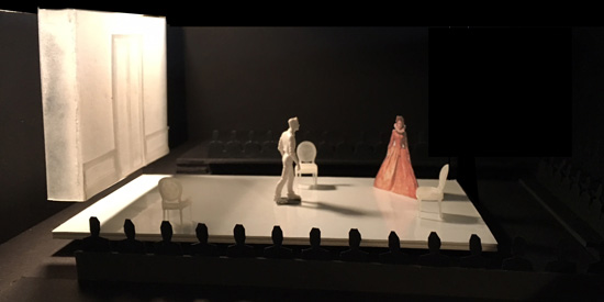
Maquette of the Orlando set design. Design concept and maquette by Lorenzo Savoini.
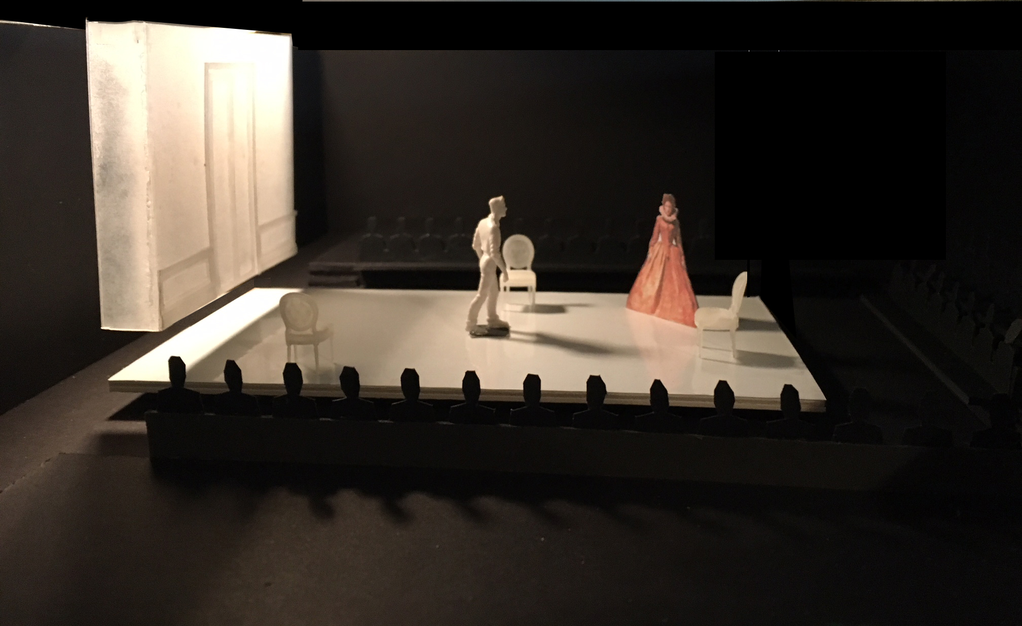
Our design tries to create a sort of blank canvas in a way that will allow for strong juxtaposition between a hi-gloss white floor and the performers and their costumes. At one end of stage is a piece of architecture, an adaptation of a Skene type portal found in ancient Greek theatre.

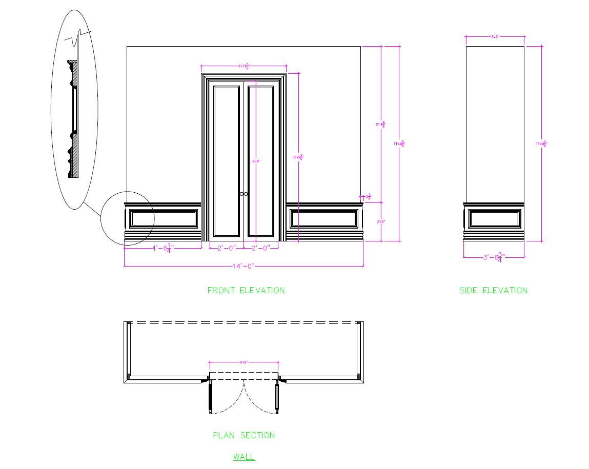
Orlando Skene drafting measurements, design concept by Lorenzo Savoini.
What makes it “Ruhl-ified” is that it is completely fabricated out of frosted plexi-glass (mouldings and all) and suspended two feet in the air. It will create a poetic dream-like world, while also helping provide a sense of place for various locations over the centuries. Much like the play, the set will hopefully appear as a simple offering until it transforms into more than what it seems.

Maquette of the Orlando set design. Design concept and maquette by Lorenzo Savoini.

Orlando lighting plots – mid process. Lighting design by Lorenzo Savoini.
Join us at a performance of Orlando, on stage July 6-29, to see Lorenzos set and lighting design come to life in full scale!
The views and opinions expressed in the articles are those of the author and do not necessarily reflect those of the organization.